iOS is Dead, Long Live iOS
Logos
There’s a saying that every end is a new beginning. And it’s a fitting thought in the wake of Apple’s release of iOS 7 that came out earlier this week—and which bid goodbye to the old-look users have been accustomed to since the release of the original iPhone. While there have been a lot of reactions online, from the elated to the angry, the one certainty is the new iOS looks brand new, but is still comfortably familiar.
There’s also some changes under the hood to the updated iOS that updates the iOS’ functionality . . . There’s an easier way to get to control center, making it so users don’t have to go through multiple stages to access options for WiFi, Bluetooth, Flashligt, AirDrop, Do Not Distrub, or Airplane Mode. There’s iTunes Radio, which aims to move Apple into the world of streaming music dominated by apps like Pandora. New multitasking options make navigation easier. Safari now allows more than eight pages to be open at a time. The list goes on and on. What was old is once again new, and we all have to adjust.
But the biggest change to the new iOS is the aesthetic adoption of flat design over skeuomorphism. Altogether “flat design” has proven to be the driving modern aesthetic for web and interface design in the last few years. Apple’s execution of this evolution towards modern design, using brighter colors, minimalistic shapes and lines is on par with the attempts of other leading tech giants—and say what you will about Apple’s design choices, but they are decidedly Apple design choices in their own way, and will soon be seen and remembered as classic and iconic—just as soon as the initial wave of sensationalism ebbs away.
The user reactions are actually a great representation of the nature of change in our culture today. We always want things to be different but are often skeptical when those changes actually come to pass. We enjoy comfort but, especially as Americans, we always want to have one eye toward the future because we know things can always be better than they are today.
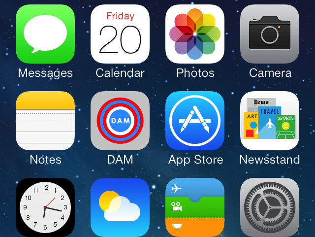
Except for the Digital Americana logo that was designed four years ago. See how its flat design fits right into your iOS7 home screen like it was made to belong there?
Close